Accessibility Demo
This webpage features accessibility issues so we can demonstrate how to successfully resolve them.


Issue 4: Link Context
Links are often used without including descriptive context. For example, this link here will only read as "here" when someone skips through using assistive technology. If there are multiple links with this same description, a user risks engaging with the wrong link destination.
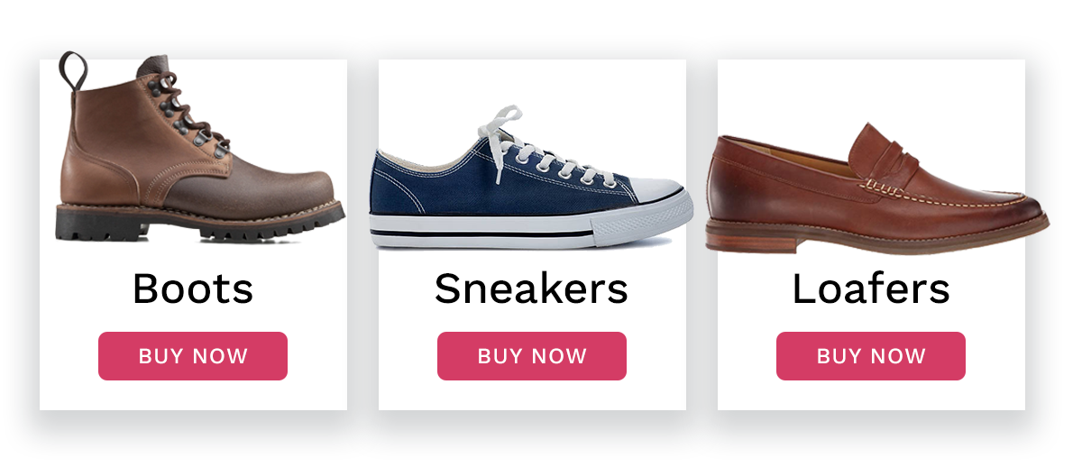
This is also a common issue with e-Commerce product pages and blog listing sections. If every item in a list uses the same "Buy Now" or "Read More" link description, users may have a hard time selecting the correct link.
When possible, be more descriptive with the text you choose to hyperlink, or the way you label buttons.
Safe Display: None
For situations where you cannot provide better link text or button labels, there is a way to include additional context for assistive technology that does not change the appearance of links and buttons. Similar to how "display: none" can be utilized in CSS to hide elements, a safe, assistive tech-friendly CSS class can be used.
Before
<h5>Boots</h5> <a class="buyNow" href="...">
Buy Now
</a>
With Hidden Text
<h5>Boots</h5>
   <a class="buyNow" href="...">
  Buy <span class="atOnly">Boots </span>Now
</a>
This hidden text instructs the link to read "Buy Boots Now."
In this demo, we will add additional context to the Sample Blog Listing "Read Now" links for assistive technology users.
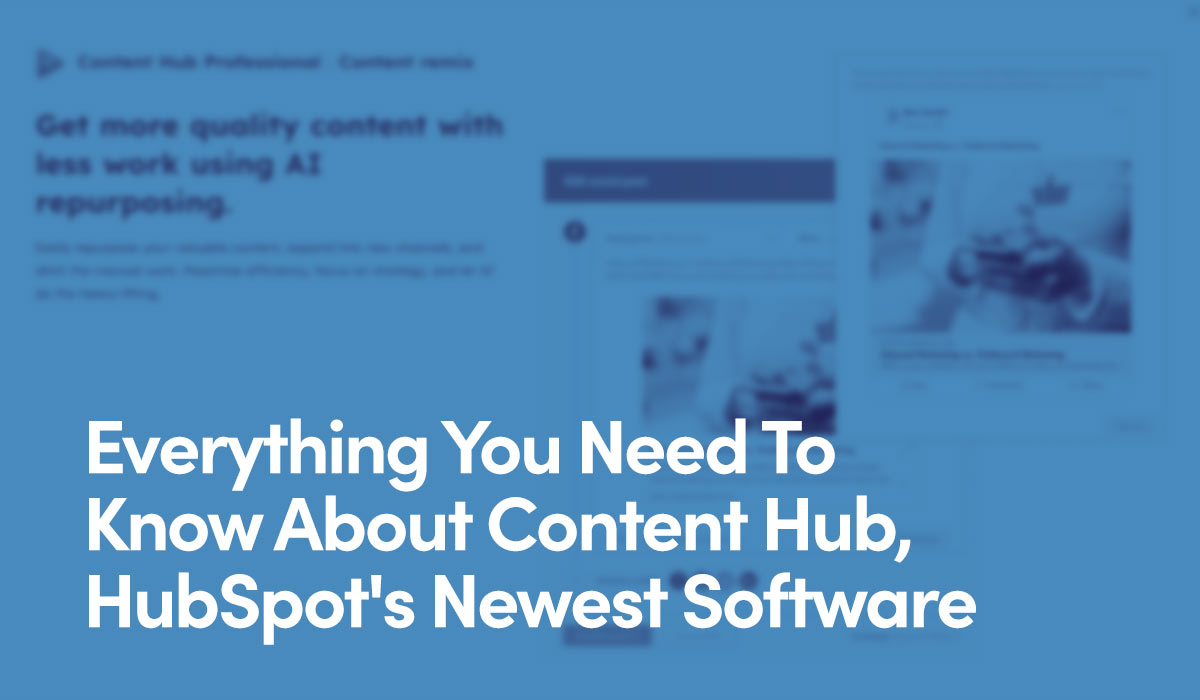
Everything You Need To Know About Content Hub, HubSpot’s Newest Software
HubSpot wants to revolutionize marketing with Content Hub, featuring blog creation, brand voice customization, multichannel distribution, and more.
Read Everything You Need To Know About Content Hub, HubSpot’s Newest Software Now
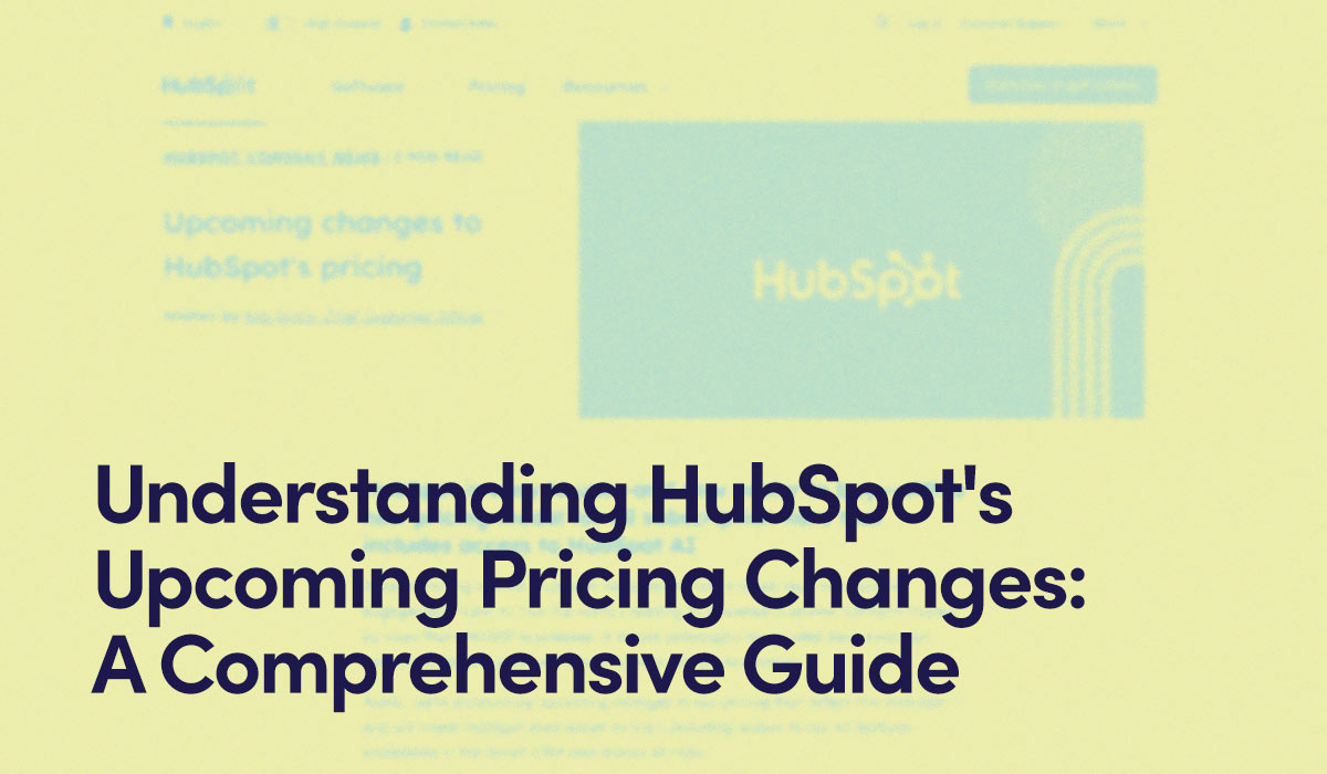
Understanding HubSpot's Upcoming Pricing Changes: A Comprehensive Guide
HubSpot is introducing a seat-based pricing model, offering Core Seats with editing capabilities and View-Only Seats for team access. Find out how this change will affect existing customers and the benefits it brings.
Read Understanding HubSpot's Upcoming Pricing Changes: A Comprehensive Guide Now
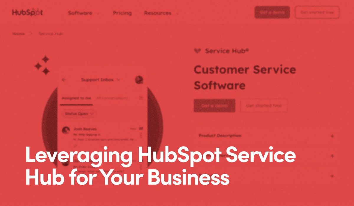
Leveraging HubSpot Service Hub for Your Business
Explore how HubSpot's Service Hub optimizes customer support for businesses, integrating AI and CRM for seamless service and enhanced customer satisfaction.

Issue 7: Heading Order
The visual design of a sentence may call for certain styles, but does that make it a section heading?
Heading tags control the size and style of different headings on a webpage, which help people understand its structure. Assistive technology users may skip through a page by <h3>s when they realize all listed products are using it.
When headings are only used for their visual attributes, and their structural value ignored, pages become very disorienting and difficult to navigate. This page uses <h3> tags as both section headings and pro tips. Imagine how hard that makes this to navigate if you are relying on headings to anchor each section.
Pro Tip: When structuring a page's heading relationships, remember: Progress without skipping heading levels. When returning back up, you can skip levels as needed.
This page is using an <h4> on the subhead directly under the <h1>, but it is not actually a heading. Rather than using a heading tag, the same design attributes can be applied with similar CSS classes. After adding the classes to your CSS file, we can replace <h4> with <p class="heading4">.

Before
<h1>Accessibility Demo</h1>
<h4>A webpage built with accessibility issues to demonstrate how they can be fixed</h4>
After
<h1>Accessibility Demo</h1>
<p class="heading4">A webpage built with accessibility issues to demonstrate how they can be fixed</p>
Another way to use heading tags but prevent them from messing up the page architecture is to add role="none". This tells assistive technology that the <h> tag can be ignored.
Using Role=None
<h1>Accessibility Demo</h1>
<h4 role="none">A webpage built with accessibility issues to demonstrate how they can be fixed</h4>
In this demo, we will create heading style CSS classes, and replace those that are not actually headings on this page.
