A logo is more than just a symbol to represent a business or organization; it's a crucial component of brand identity. The right logo can leave a lasting impression, while a hastily made logo—or none at all—may come off as thoughtless and unprofessional. Let's take a look at the value of a great logo.
An apple with a bite taken out of it, golden arches, a check mark—company names have been removed from the logos below, and yet they are still instantly recognizable. That's applicable to many widely known corporations. But why does your organization need a good logo?
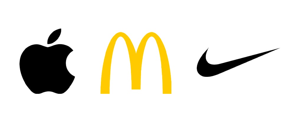
Apple, McDonalds and Nike logos
Brand Identity
A logo is such a small graphic element, and yet it is the single-most definitive way consumers connect with your brand. It appears on marketing material, your website, collateral, promotional items—everything.
Your logo is also the foundation from which all visual representations of your business are built upon. It defines the vibe and purpose of your brand, and shares your message via every marketing piece utilized by your organization.
A great logo illustrates who you are as a company, and should be reflected in everything you create.
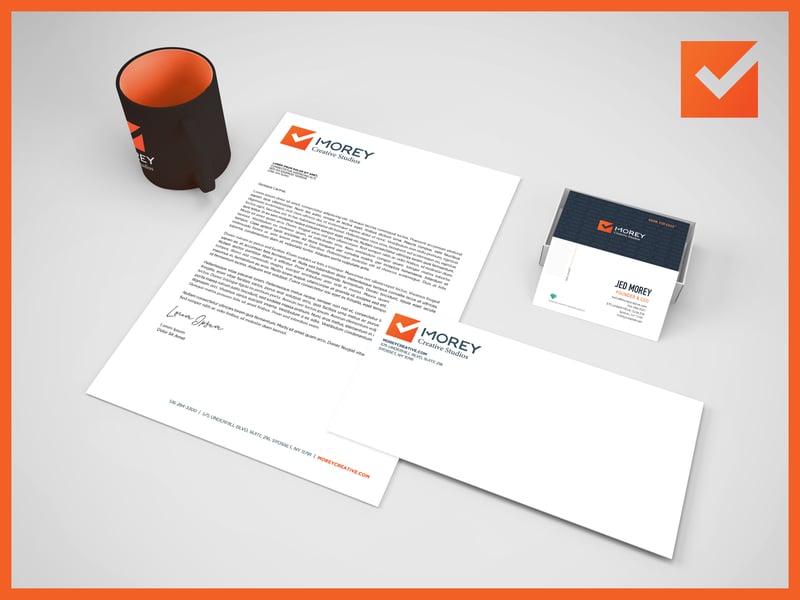
Our predecessor Morey Creative's primary color was orange—an energetic tone projecting warmth, enthusiasm, and excitement.
Recognition
Logos are recognizable from the very first glance, so wherever it appears, it'll remind prospects about you and your services.
You may think I'm over emphasizing the importance of a logo, but you may care about logos more than you think!
Think about large organizations that have rebranded and changed logos. How awkward did it feel at first? You have spent so much time associating this graphic with this company, and now it's different. This can be quite jarring!
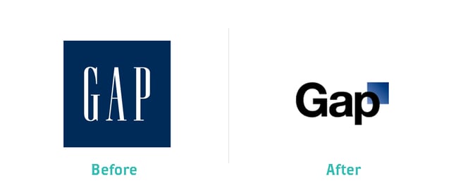
Case in point: Global clothing retailer The Gap attempted a rebranding in 2010, to disastrous results. Consumers were so unhappy with its new logo that the company reverted to the original less than a week later. In 2016, Gap tried again, simply removing the blue box and leaving the font of the company name the same. This incarnation was significantly better received.
Professionalism
As aforementioned, the logo is an important representation of who you are as a company, brand, and what you can offer your clientele.
Your logo can also give viewers an impression of your company's approach. For example, a company trying to present an image exuding the utmost professionalism might benefit from a crisp, clean design composed of cooler colors. To denote a more creative, whimsical vibe, warmer colors and brighter imagery may be the direction to take.
Consumers often associate the quality of a logo with the quality of a company’s offerings. A messy, poorly thought out logo gives the impression you may not care as much.
If the business doesn't care how its logo looks, how much will it care about customers?
If its logo hasn't changed since the 1980s, how can a client know whether the company has modernized since then or provides up-to-date and relevant solutions?
A beautiful logo successfully representing your company will also likely draw more patrons, providing a significant advantage over your competition.
Imagine viewing material from our previous incarnation for the first time, with this logo:

What kind of impression would we be making? The typography is messy, not only using a juvenile font, but also failing to consider text alignment. The logo itself is an old-school clip art image. Would you trust that we're leaders of our industry with a logo like that? While our infectious charm may help, such a design gives an unfavorable first impression, diminishing our perceived professionalism and competitive advantage against other agencies that have put more work into their branding.
So, what makes a great logo?
While a logo is typically a simple graphic, creating the right one demands imagination and strategy. A great logo should be:
- Unique Enough to Stand Out
- Easily Recognizable
- Displayable Online & in Print
- Scalable & Effective, No Matter the Size
- Impactful, Whether Color or Black & White
- Simple & Easily Digestible
- Most Importantly: Representative of Your Organization & Brand
To summarize: A great logo serves multiple purposes and conveys several key messages to existing and potential clients, including:
What You Do
Your logo should visually encapsulate what your company does. A pretty but irrelevant image does not serve a purpose, and is useless. Attractiveness is simply not enough. Don't be afraid to get figurative with it.
For example: A computer company shouldn’t confine itself to using an image of a literal computer. Think deeper about what your business does for clients. Such a company connects users to systems, as well as each other. A logo portraying this could be incredibly impactful.
Who You Are
Is your organization serious and formal? Creative and friendly? Modern and innovative? Your logo should be, too! Your logo is your first visual impression, communicating what working with your organization will be like.
Let's go back to our hypothetical computer company, as an example. Technology is ever-evolving, forward-thinking, and innovative. This should be reflected. An old-school, out-dated design gives the impression its tech is behind the times—which can be very bad for business.
Your Brand Identity
As discussed, your logo embodies the very soul and essence of your business, and therefore, special thought and attention must be given to three key areas:
- Color: Much research has been conducted on the psychology of colors. Ensure the tones of your logo (and branding) convey the impression you want to reflect.
- Typography: The fonts and structure of your logo’s text are important. Serif vs San-Serif fonts, for example, give off different impressions, plus, there are many options within both categories. Some organizations incorporate the text into the logo’s design. These are all important considerations.
- Style: Does your logo have a 3-D element? Does it include flat colors? Does it have a gradient? The style of the imagery significantly impacts your organization’s image, as well as the direction of your other branded materials. Consistency is important, so consider this, too, when planning everything out.
Here are several examples of great logos that check all the boxes:

Logo creation is a process, and an important one. Don't be discouraged if it takes a substantial amount of time to design a logo your organization is happy with. Once achieved, it’ll be well worth it.